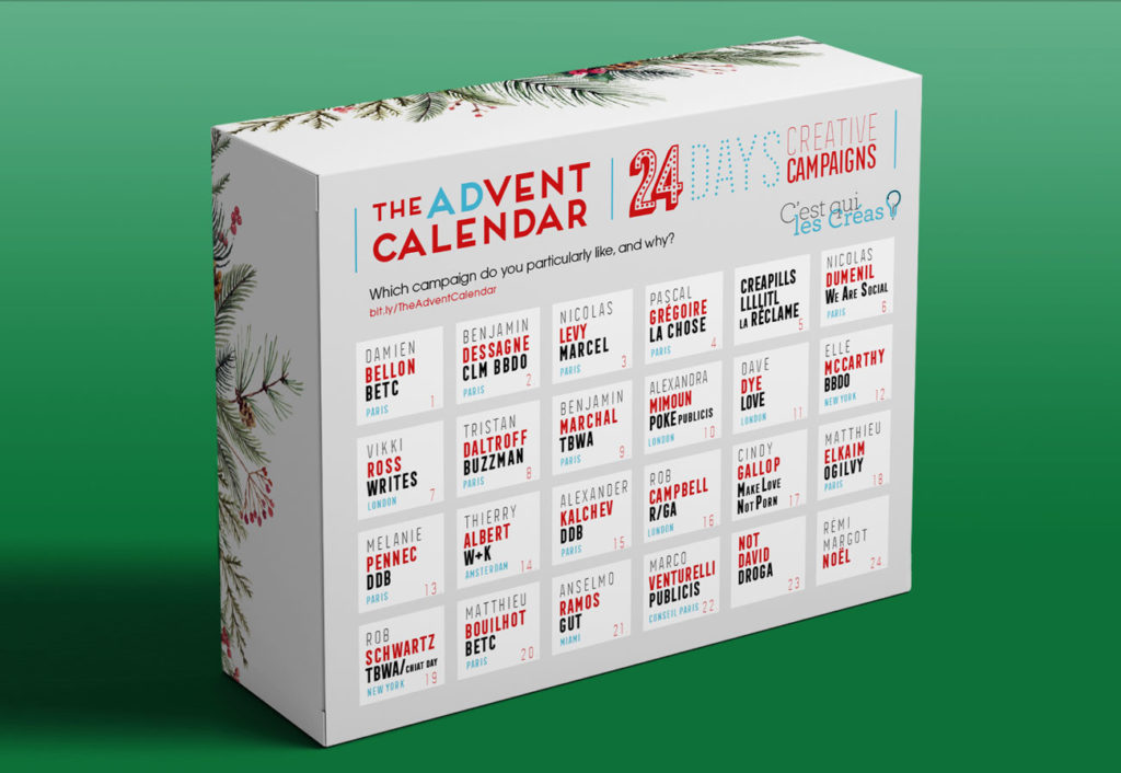
24 days before Christmas : One ad per day in people’s inboxes, picked by famous and passionate creatives who explain why this ad, in all the world, is a must-see.
(Sometimes Creatives who did the campaigns, gave us an anecdote).
– Gregory Ferembach
1/ Damien Bellon / BETC Paris
Hello, To wish you a happy new year and present work I find extraordinary, I decided to talk this film on the Paralympics: « We’re the Superhumans ».
Channel4 promote their broadcast of the Rio Paralympics in 2016 on the English channel. The concept of the previous campaign (for the London Paralympics in 2012) was the same, but the signature evolved a little. « Meet the Superhumans » became « We’re the Superhumans » on Dougal Wilson’s film.
Why this movie: Because it beats a lot of records.
For example, in less than 5 minutes, it succeeds in changing our view on people with disabilitu. A “diminished” person becomes a superhero, and it works.
Because it sends a spectacular message of optimism and humanity.
Because it just makes you want to watch the Paralympic games.
Because it is the second movie with this strategy & brilliant signature.
Because it demonstrates to critics that advertising is not just here to sell useless industrial products. It can also be generous, entertaining, make you laugh, make you dream … and sometimes even change mentalities.
Because the craft is incredible (casting, music, editing, intro, ending, etc.
Because it reminds creative people, agencies, clients and all the players in our industry, including legal services, that despite the obstacles, politics, fear of risk, budget problems etc, etc. « yes, It’s still possible to do a great job » and we all have a role to play, that starts with believing it.
Because the director (Dougal Wilson) is an angel and a genius who when congratulated on this work, replied: « Thanks, well, we’ve been lucky with the music » even though the whole craft is a slap in the face.
Because it’s a mainstream commercial before being a movie for an awards jury.
In short, for all these reasons, and also of course that it remains a pleasure to see and review this work, I chose this film filled with optimism to wish you a happy new year 2020.
Damien Bellon.
Art Director, Creative Director, BETC Paris.

– – –
Agency ; 4 Creative / Creatives : Chris Bovill, John Allison, Alice Tonge.
Director : Dougal Wilson / DOP : Dan Landin
2/ Benjamin Dessagne / CLM
I have a lot of campaign in mind, but now, here, I think about : “I am Mumbai”
Why?
Because it may be one of the biggest slap I took when I saw a movie.
There are many more that I could have mentioned, some with more pointed concepts, with more unexpected falls.
But the trace left of it is masterful. I discovered it in Cannes in projection at the Palais des Festivals.
It’s a Grand Prix Craft, and yet I’m not a Craft guy just for Craft. This film is not just that.
There we have an idea of a strength and a rather rare simplicity.
It is a powerful representation of this newspaper, which wants to be the mouthpiece of a dilapidated city, in its inequalities, its brothel abounding and its chaotic life. This city is this newspaper. This newspaper is this city and vice versa. Each page is a debate, an encounter, a fight.
Benjamin Dessagne
Creative Director, CLM BBDO
– – –
Click here for more informations about this campaign
Agency: TapRoot India
Creative Directors: Santosh Padhi, Agnello Dias
Copy: Agnello Dias / Director: Abhinay Deo
Thanks for this. It is a privilege and an honour.
Much gratitude to Benjamin too for being so appreciative and complimentary about it. Heartening to know that something that is seemingly so local and personal can reach out across continents and touch a chord elsewhere.
When the client met me, all they had was a good old-fashioned client ask:
HIGHLIGHT THE PRODUCT. These are the stories we ran, can you make a film highlighting the stories. When I sat down to write it, all I had was good, old-fashioned creative ask, IS THERE SOMETHING INTERESTING I CAN PRY OUT OF THIS ?
Which led me to the simple observation that here was a ‘thing’ that disturbed our peaceful urban, Insulated-from-the-world, breakfast every morning. A city newspaper that amplified the unheard voice of Victims into an angry snarl that barked into our fancy living rooms.
Executing it was nervous and tense as we took the decision to go with native black and white (which means it wasn’t even shot in colour) on the floor of the shoot without a client go-ahead. It was a gut call and it came off.
The last scene (packshot) was iconic, reminiscent of how I, like so many Mumbai people have travelled every morning.
There was a follow up ad that took new stories but this time, told it from the point of view of the perpetrators rather than the victims
and obviously from their point of view, they hate the campaign and the newspaper.
Here it is : https://www.youtube.com/watch?v=2iTWJiEeCuI
Agnello Dias
Founder and CCO, Taproot Dentsu
Creative Chairman DAN INDIA
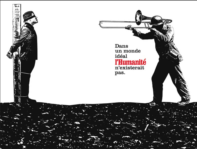
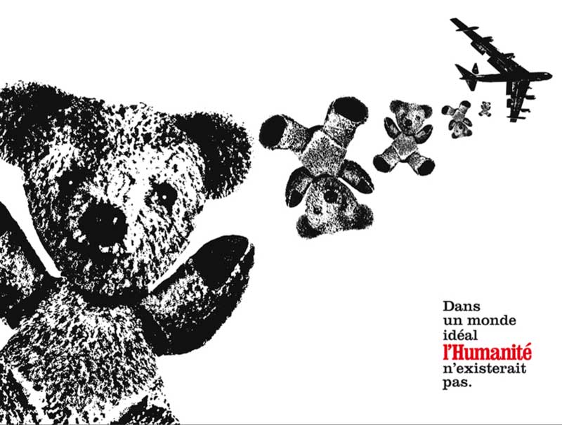
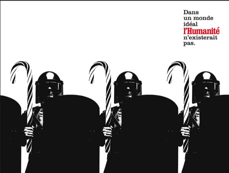
3/ Nicolas Levy / Marcel
It’s almost Christmas, but at the risk of ruining the atmosphere a little, I chose « In an ideal world Humanity wouldn’t exist » by Leg-agency, released in 2003, my favorite French campaign of all time. It actually is a little depressing, because, 16 years later, Humanity needs to exist more than ever. (« Humanity » is the name of this newspaper)
And also because, even if deep down nobody is ready to to give in and admit that our industry’s output used to be better, when you look at this campaign it’s only fair to ask yourself the question. But fortunately, there’s also a way to look at it that feels galvanizing: its perfection on all levels (the meaning, the line, the choice of each situation and the artistic direction on the whole, perhaps inspired by Banksy’s early work?) reminds us of the best that this job can offer.
This campaign is like a great record, and the first time I saw on a subway platform the poster with the plane dropping the teddy bears, I took a slap comparable to the first time I heard Nirvana. It was 2003, I was about to finish my studies and had to make a choice of orientation. This campaign made me want to do this job. I never regretted it, so : thank you, whoever you are, who contributed to this.
And, like a great record, every time I look at it again, I discover something new.
Nicolas Levy,
Managing Partner & Chief Strategique Officier
Marcel Paris
Click here to see more posters from this campaign
Agency: Leg / Creative Directors: Gabriel Gaultier
Copy: Gabriel Gaultier / Art Director : Yves Loffredo
In early 2003, during the second Gulf War, Gabriel Gaultier contacted me to create this campaign with him for L’Humanité, the press organ of the PCF (the French Communist Party). To illustrate his signature, he wanted me to recreate the impact and simplicity of my previous work for Jet Set Records, the Jamaican music reissue label. This is how I got the opportunity to start this campaign as an Art Director and illustrator and to design the first three posters, using the same methods.
To talk about this campaign as a « large record » sleeve means you got it. However, Banksy was not its inspiration. As a matter of fact, in 2003, I probably hadn’t discovered his work yet. Much more than the calls for peace, it is the calls for justice that are fascinating: they always have more impact and come « from within » all movements. It is graphic design as a weapon. The art direction of this campaign is not an attempt to do something « à la » anyone, just as it would have been awkward to draw any inspiration from, for example, Russian constructivism, which was not anti-establishment.
What may be quirky for Virgin Megastore (1995-BDDP agency) would have dramatically lacked taste for L’Huma. This graphic language was more influenced by cultures I encountered well before Banksy: the iconography of Non-Aligned Socialist Algeria (« Algiers capital of the revolution »), fanzines, records from England’s early 80s (Jamie Reid, The Clash, 2 Tone ), the graphism of 60s records hunted in Jamaica, flyers of the 90s London, or the 70s posters of the ANC (African National Congress) some of which are visible in museums in Johannesburg (like the beautiful Apartheid Museum) and of which I tried, unsuccessfully, to find the originals there.
Being a big enemy of pixels, that you had to fight at every step of conception at the time, I obviously worked from printed material and my flash dryer’s tools for the final rendering. Some source material came for instance from Pascal Couvry, who was close to Korda, Che Guevara’s official photographer, and gave me access to his archives and image publications on the Cuban Revolution.
But on top of the visual, there is above all the nobility of the defended causes: the denunciation of American interventionism or police brutality, topics I will let everyone transpose to present times. The intelligence of the words, the visual impact, the medium, it was a bit like the gift advertising could offer to L’Humanité.
Yves Loffredo
Directeur Artistique , Jesus et Gabriel.
4/ Pascal Gregoire / LaChose
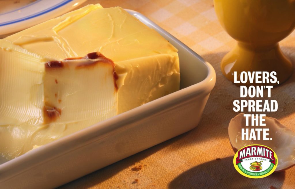
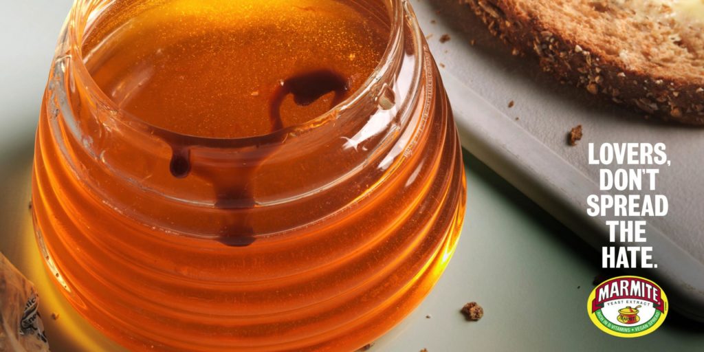
Marmite is an acquired-taste that has always divided the Brits between the haters and the lovers. I have always liked Adam&Eve DDB’s Marmite campaigns. Especially the films “rescue” and “gene project”.
The latest campaign “Don’t spread the hate” is a masterpiece for me. There is nothing stronger than a brand that knows how to play with the culture, the history and the personality traits of its own audience. To me this little butter knife that could, with the double meaning, “spread” the hate is the perfect symbol of the British spirit. Because using the same knife for butter, jam or Marmite…is simply shocking!
Pascal Gregoire
La Chose CEO.
Click here to see more posters from this campaign
Agency: adam&eveDDB / Creative Directors: Richard Brim
Copy: Simon Vicars / Art Director:Ándre Sallowicz / Photo: Jason Hindley
In order to present this idea to Marmite, we shot our own version at home using butter from the fridge. Andre dropped the line onto the image, printed it out and put it on our desk. A Producer mate of ours walked past, looked at it and said, « Oh man, I feel violated. » We knew we had something special.
Simon Vicars
copywriter, Adam&Eve DDB
5/ La Reclame / Creapills / LLLLitl
Cannes, June 2017. Fearless Girl wins 4 Grands Prix, but I don’t really get it (the fraud will be revealed later). The festival has not yet switched from « creativity » to « charity ». During an award evening, the Palais’s auditorium is hilarious thanks to a Thai spot for a dietary supplement that helps transit.
This is not a cult ad. The 3:18 edit now seems a bit long. But the casting is perfect, the narration is unexpected and the product benefits are well shown. This film bring us back to Cannes’ good old times, where we could discovered gems of humor from distant countries. This ad does not support any cause other than its product and its customers.
With an aging population in the West, the pharmaceutical industry is likely to become much more important in the advertising market in a near future. And, who knows, « pharma » could surprise a little more.
At least you will know how to process all the good fat that awaits you during the holidays …
Xuoan Duquesne.
La Reclame.
– – – – – – – – – – – – – – – – – –
It was created by TBWA \ Belgium for the Maes beer brand. This is probably my favorite operation. It’s a marketing operation that I find totally crazy and great. To understand it you have to recreate the context. Maes is a brand of beer, but also the 3rd most used name in Belgium. So, the creative people said to themselves: « We only have to offer beer to all the people who call themselves Maes on Facebook ». Until then it is well played but nothing more. What I find great is that the « Maes families » have suddenly become very popular on Facebook, until other people decide to rename themselves Maes on Facebook to benefit from the promotion (a beer keg) .
I have no idea what it has been able to do in terms of commercial transformation, but on paper the fact that Internet users change their name in thousands to take that of a brand is really great. What is more effective? In the end, Maes became the most popular name on Facebook in Belgium. In short, the operation does not age and it still amuses when I present it in conference, even 7 years after its release!
Maxime Delmas
CREAPILLS
– – – – – – – – – – – – – – – – –
In a season where brands compete creatively, but sometimes a little too exclusively through tv commercials, how not to revisit this Harvey Nichols stores’ marketing masterpiece for Christmas 2013?
Perfect model of what an integrated campaign is, « Sorry I Spent It On Myself » was precisely much more than a series of very funny tv commercials: a true -big idea- as we like them, perfectly well executed on many touchpoints aligned with the targeted consumers (billboards, e-commerce, press, public relations, retail…). A performance honored by 4 Grand Prix at the Cannes Lions 2014: « Film », « Integrated », « Press » and « Promo & Activation », just that.
Matthieu Etienne
LLLLITL
6/ Nicolas Dumenil / WeAreSocial
The campaign everyone has to see for the Saint-Nicholas feast day, december 6, is a campaign made in 2014 for client Adidas : « REINVENTING THE AUTOGRAPH »
Why this campaign is a must see?
First, because Xmas is calling and this brand activation gives this kind of magic to kids. Also, for me it represents the perfect example/idea to follow/do.
An accurate insight, served by a simple execution to deliver an outstanding brand promise.
At the beginning, there’s this obvious fact that every meeting between a celeb and his fans ended with a signing event. A morning routine for the star tired of these signing duties but a once a lifetime moment for fans who have the chance to get this gift. A little thing but which has the power to make everyone feel privileged, aware to bring back home something unique that belong to their idol.
However, when you think about it, you can challenge the value of an autograph and ask if it’s something as unique as it should be? All day long to wait for hours to live a dream for only a second, and as soon as the celeb has signed on the fan’s shirt or the poster, it’s already time to leave the place for someone else! So, what really does an autograph, except to repeat fan after fan the same writing or words, that make the autograph loose its value of uniqueness?
And yet…
Yet the creatives here were brave enough to revisit the concept of signing. Brave enough to dare to redefine the lines of something personal, something that belongs to us and that define every single individual: its signature.
Thanks to a clever use of the technology, signing has become an experience to live. An experience in three dimensions where every interaction between the fan and its idol recreate the move of a unique and exclusive signature in the air. From now on, an autograph can be written both with the fan and the celebrity.
As we are talking about basketball and about Dwight Howard precisely, it was quite clear that the best place to sign his autograph was on a playground. A place that tells us this story: This moment where, on a basket-ball court in Manilla, a young kid marked a basket facing its idol, an NBA star.
Give back a lost meaning and value to a signature – here’s something remarkable which deserves way more than 2 shortlisted nominations at Cannes!
Nicolas Dumenil
Creative Director We are social
Client: adidas
Agency: TBWA\ Singapore
Creative Director: Hagan de Villiers / Copywriter: James Holman
Art Director: Nuno Teixeira / Planner: Steven Watson
TBWA\Santiago
Mangada Puno Nino Reyes (Assistant Creative Director)
Jake Tesoro (Creative Director)
– – –
7/ Vikki Ross / write
Choose an ad, Greg said.
Choose an ad from any time and for anything, Greg said.
So I didn’t.
I could have.
I could have chosen ‘Snow Plough‘ for VW.
Or ‘Crazy one’ for Apple.
Or ‘Orange Man’ for Tango.
Or ‘Third world debt’ for Oxfam.
Or ‘Try Harder’ for Avis.
Or le ‘Father’s Day’ for Chivas Regal.
Or ‘Management Trainee’ de The Economist.
And I could have gone on. And on and on like Ariston.
I could have.
But I didn’t.
I chose ‘terms and conditions’.
Yep, terms and conditions.
Terms & Horrible, Horrible Conditions for Xbox Survival Billboard.
I chose this work because it’s bold, brave and brilliant.
It’s bold because it’s unexpected.
It’s brave because the idea would’ve challenged the copywriters, the agency, the client and their legal team.
It’s brilliant because every line keeps in line with the campaign, the brand personality and the tone of voice.
And it’s probably the only piece of legal copy ever read from start to finish by real people – the people who really matter.

– – – – – – – – – – – – – – – – –
Agency Network: McCann October 2015
Advertising Agency: McCann, London, UK Chief Creative Officers: Rob Doubal, Laurence Thomson Creative Directors: Sanjiv Mistry, Jamie Mietz Integrated Creative Director: Chad Warner Copywriters: Jim Nilsson, Sanjiv Mistry, Anja McGuiness Art Director: Jacob Bjordal Designers: Colin Lee, Danny Elliot Planner: Thomas Keane Head of Art: Michael Thomason
When you find yourself in the rather odd position of making an ad to advertise another ad you’re making, there’s one more thing you should make: peace. Peace with being so deep down the advertising rabbit hole that the usual rules no longer apply. Up is down. Black is white. And terms & conditions need not be buried at the bottom of the page.
In 2015, the new Xbox game Rise of the Tomb Raider represented a change in direction for the long-running series. It took a darker turn, with a main character in Lara Croft who had become tough and emotionally complex.
To reflect the gritty tone of the game, we’d sold in an idea called Survival Billboard – a huge outdoor ad on which a few ordinary people would stand in a Lara Croft-esque test of inner strength, facing harsh weather conditions controlled by the public. But first, we had to find people brave (or foolish) enough to volunteer.
We’d wanted the billboard to be a spectacle that would last for well over 24 hours. Which meant we needed participants who wouldn’t drop off at the merest whisper of a breeze or suggestion of drizzle. So rather than do as most competitions do and encourage everyone to enter, we instead decided to discourage the wrong sort from applying in the first place. A call not to enter.
Then, in discussing the health and safety implications of Survival Billboard with our lawyers, it also soon became clear that we’d have to, at some point, tell people what they were putting themselves in for.
And so Terms & Horrible, Horrible Conditions was born. An ad that made a virtue of what’s usually an advertising curse. Rather than shorten the T&C copy, we actively worked with our lawyers to lengthen it. This became not just our copy, but our visual too – its sheer size alone communicating the intimidating nature of the challenge that awaited on the billboard. These ran as press ads and as posters placed in front of gym treadmills across the UK, targeting those both fit enough to participate and with enough time to read the whole thing.
The process of crafting the ad was highly unconventional, and involved a close collaboration between McCann’s copywriters and lawyers. Never have two more different sets of people haggled over adjectives.
Over the course of several weeks, creative and legal went through a back-and-forth dance for dominance. We were determined to make it not only compelling to read, but entirely legally binding as well.
This was both a constructive and destructive process. Sure, certain evocative words or turns of phrase were blocked with less inflammatory ones. But new creative writing paths opened up from our discussions too. Lists, for instance. Lawyers tend to want to limit liability by clearly listing adverse side-effects, often using the phrase “including, but not limited to…” to save space and account for the things most likely to occur. We embraced that as a creative outlet, listing not only the likely, but also the many highly improbable possible outcomes from standing on Survival Billboard.
It was, in the end, this collision of wildly different attitudes towards writing and its purpose that made the project worth doing. And in recognition of the value that our lawyers brought to it, we co-credited them as copywriters on our award entries. They probably are, to this day, the only lawyers to have won a D&AD pencil for writing craft. Or indeed, probably the only lawyers who’d know what a D&AD pencil is.
SANJIV MISTRY
ECD EMEA McCann London
8/ Tristan Daltroff / Buzzman
Dear Santa for Christmas, I would love to have the new Call of Duty. Please? And also, because I’ll spend the whole year playing with it, could you bring me someone to take my place for the rest of my obligations?
It’s a bit long for a PR title, but I think it’s good way to introduce this thing. How to tell the target that this next game is super addictive?
The Replacer Campaign from 72 and Sunny stay, in my opinion, one of the best gaming campaign I know.
Just behind the iconic film “jump in” for Xbox and Sega “Stronger than you” of course. Every time I look at The Replacer, I’ve that weird kid smile on my face. How not to love something like this? The starting point is so well observed. The idea of needing to be replaced in life to fully play at video games is disturbingly obvious but brilliant. Also, the way they did it is fucking amazing. So yes, the compliments flows all over the place, but that’s the aim of this newsletter isn’t it?
Then let me continue. The directing is humble and efficient. The actor is a genius and the phlegmatical character he embodied is the perfect fit for him. Everything that happens and the comedy of it match perfectly in this smart and insightful choice of scenes, all that on a ACDC amazing song.
And they even add a 1.40 minute product demo you want watch until the end. Everything is perfect. It can only be done when the 7 chakras of advertising align perfectly. It’s rare, and beautiful.
It’s not only a campaign that might have sold tones of games, but it also makes you want to be in the advertising industry.
Anyway, it was followed by different sequels, proving that the idea was good.
And even if, like in all the sagas the last one is often a bit of a failure (Les Bronzés 3, Matrix 3…), I recommend you watch it in its entirety( link below).
Merry Christmas.
TRISTAN DALTROFF
Directeur de Création
BUZZMAN
January 2013 / Advertising Agency: 72andSunny, USA Chief Creative Officer: Glenn Cole Executive Creative Director: Frank Hahn Creative Director, Copyriter: Josh Fell Creative Director, Designer: Rey Andrade Lead Copywriter: Zach Hilder Copywriter: Matt Spicer
9/ Benjamin Marchal / TBWA
t’s always a very tricky question to answer.
However, I’ve finally chosen the Volvo Epic Split, with JCVD.
It’s neither the most innovative nor the smartest film, and even less the “hit case study” with its millions of likes, but this film feels so good, and shows us the way we should be going back to.
So, according to me, why is this spot an example to follow in 2020 ?
Because above everything, it’s a piece of entertainment, of delicious surrender. Unfortunately, nowadays we are craving for both these ingredients.
Let’s rediscover a breath of fresh air and ease. Let’s stop wanting to save the world or to soften people in a sentimental way. I’m militating for the return of the smile and the “wow effect” which are the foundation of our profession of craftsmen.
In addition, this spot made it from its simple add’s framework, and has led to remakes all over the world. Not to mention, the one with Chuck Norris on the plane which is absolutely extraordinary. And the challenge is here, to take back our seat at the table of the pop culture.
Advertising in all its forms still have a lot to give, if it stops to take itself seriously and recover its fundamentals: engaging, entertaining… to make us forget it has something to sell.
It’s time to disconnect our brain and let our heart and guts speak again.
Benjamin Marchal
ECD. TBWA Paris.
Click for more information about « Epic Split »
2013 / Client: Volvo
Agency: Forsman & Bodenfors
Copywriter: Bjorn Engstrom / Martin Ringqvist
Art Director: Anders Eklind / Sophia Lindholm
Director: Andreas Nilsson
Photography: Ed Wild
We had planned the production in detail and since we wanted to shoot at sunrise, time was extremely important. We had calculated that we would have time to do three takes in great light but nailed it the first time.
In perfect time for the sun to rise as a backdrop for the trucks.
Sophia Lindholm
Art Director
Forsman Bodenfors
10/ Alexandra Mimoun / Poke
I’ve chosen Whopper Detour – big winner in Cannes this year obviously.
The idea is brutally simple: consumers could get a Whopper for just 1 cent, but only if they went to a McDonald’s location. It’s a coupon basically. But it’s much more than that. It’s trolling at scale. And it’s simply brilliant.
This idea is so true to the DNA of the Burger King brand – a brand that’s always had this challenger spirit. It’s the kind of idea that can’t really be put in a box. It’s in the sweetspot between commerce, experience and comms.
And more importantly, it has had a direct and significant impact on the business and at the end of the day, that’s what makes a great idea.
Alexandra Mimoun
Head of Integrated Planning at Publicis
Client – Burger King
Agency: FCB New York
Ari Halper – Chief Creative Officer
Fred Levron – Worldwide Creative Partner
Gabriel Schmitt – Group Creative Director
Laszlo Szloboda – Associate Creative Director, Copy
Alex Sprouse – Associate Creative Director, Art
Akos Papp- Associate Creative Director, Art
11/ Dave Dye / Love&Fear
Write about an ad you like.’
A single ad? How the hell do I pick a single ad from the whole history of advertising?
I could pick a new one, but chances are you’d have already seen and retweeted it before this reaches you.
I’ll have to give myself a criteria, to try and narrow it down.
Think of an ad I wish I’d done?
One that affected me?
That isn’t posted every other week on Twitter?
Whatever springs to mind I…Sony ‘Lifetime’.
Right, that’s it, don’t over think it, just write about it.
Why isn’t that more famous?
To be fair, it’s pretty old; mid-eighties.
‘Pretty old’ to me, pre-historic to many of you.
Last week a photographer told me they loved an old airline campaign I’d done “I loved the retro ‘90s styling”. It wasn’t retro styling, it was done it in the ‘90s I told her.
I digress.
Maybe it’s not better known because it’s by John Webster.
It’s hard for an ad to get noticed when it’s in the same room as John Smith’s ‘Arkwright’, Smash ‘Martians’, Cresta ‘Bear’, Sugar Puffs ‘Honey Monster’, Humphrey’s Straws, The Guardian ‘Skinhead’ and on and on and on.
If you took out his top 10 ads his reel would probably still be better than anyone elses.
I remember seeing this ad on tv when it came out, that’s how we used to see good ads back in the day, we’d see them in our daily lives, not just in an awards book.
Anyhow, as a freshman art director, one year in, with a head full of simplify, simplify, simplify, this seemed like the simplest ad I’d ever seen.
Now, like then, lots of people talk about of the need for simplicity in advertising, few of them create simple ads.
Simple looks easy, it’s hard.
Also, simple scares people.
No edits?
Locked off camera?
Just an image?
Only 3 words?
Somehow it’s easier to buy and sell complicated.
It makes everyone feel smarter I guess?
But, as Einstein said ‘If you can’t explain it to a six year old it’s because you don’t really understand the subject’.
A 3 year old could understand this ad.
They’d probably laugh too.
The brief wouldn’t have been anything special, ‘Our tv lasts a long time’ was what you said if you were selling tvs at the time.
So an audience might think ‘they’re bound to say that, they make the bloody things’.
So how do you ‘sell’ that message to an audience?
Make it credible?
Watchable?
Like-able?
In Webster’s hands it was new news, breaking news that would stop you leaving the room to make a cup of tea.
Yet it looks so easy.
It couldn’t have been simpler; a locked-off camera, a white sofa with one or more people on it.
Simple, but boy did they pack a lot in.
A lifetime in 30”.
Actually, 25”, the end-frame is 5”.
And that music, where do you find a track like that? It fits the visuals like two bits of a jigsaw.
Genius.
Dave Dye.
CD, Love&Fear«
CLIENT: Sony Trinitron TV.
AGENCY: BMP.
WRITER & ART DIRECTOR: JOHN WEBSTER.
DIRECTOR: ROGER WOODBURN.
YEAR: 1985.
12/ Elle Mc Carthy / BBDO
A joyous and unadulterated celebration of every woman’s lady bits. What more could anyone want for Christmas?
When I first saw Viva La Vulva, it was like nothing I had ever seen before. It’s also doing an important job – as the ad points out – many women haven’t even seen their own vaginas. But AMV and brilliant director Kim Gehrig aren’t heavy handed with this insight.
The ad is a vaginal version of Disney’s Fantasia, set to Fat Boy slim’s ‘Praise You’. The result is effortlessly anti shame without laboring the point or congratulating itself. For me, this is why it feels ok that it comes from a brand.
Elle McCarthy
Global Head of Planning, BBDO Ford
2018 / Brand: Libresse
Agency: AMV BBDO
Executive Creative Director: Alex Grieve, Adrian Rossi
Creative Director: Toby Allen, Jim Hilson
Art Director: Diego Cardoso de Oliveira
Copywriter: Caio Giannella
Strategy: Margaux Revol, Alaina Crystal, Bridget Angear
Viva la Vulva was without a doubt the hardest thing we’ve ever made.
The project « died » not once but multiple times before it finally got out.
It wouldn’t have happened without the unmovable support of an entire agency and two incredibly passionate clients.
Looking back, Viva la Vulva’s story is one of defiance.
We had to go against industry regulations, societal stigmas, and cultural norms.
But instead of treating this issue seriously like you would expect, we decided to push against taboos with a smile.
Singing loud and proud.
We chose joy over anger.
Diego Cardoso de Oliveira & Caio Maroni Giannella
Click for more information about it
13/ Mélanie Pennec / DDB
So young reader, this is an advertisement that has aged a bit. Finally a case study of 4 minutes 51 where we hear the word « blog » and where we can read the phrase « Top 20 viral videos ». And a ‘Cyber’ Grand Prix without any mention of shares or likes in the end : « the fun theory »
But. I do not really know what it is, a favourite ad , but my possible answer, it would be the one that opens the chakras (I am currently in India, I want to point out), the one that makes you realize that « ah yeah can we do that too? «
In 2009 I was still in school, but to understand that advertising could mean turning a subway staircase into a giant piano to make Volkswagen visible, wow, it seemed revolutionary.
Well then I’m not quite sure that at the time I really understood why it was great, I did not know the word « insight » all that. But now that I’m old and sour, obviously it was funny and cheery, but especially so smart.
Hey little crooks, you too will have taken ten years in ten years.
Mélanie Pennec
Creative Director, DDB Paris.
Click for more information about it
2009 / DDB Stockholm
CD Andreas Dahlqvist
Copywriter Martin Lundgren
Art director Simon Higby
14/ Thierry Albert / W+K
I picked the Southern Comfort ad.
Because that’s how we should all be walking in life.
Not necessarily in speedos, but definitely bold, confident, with a smile on our face and above ANYTHING else, not giving a damn about what others think of us.
Merry Christmas to you, my friends.
Thierry Albert ,
Creative Director, Wieden+Kennedy Amsterdam
Click for more information about it
Agency: Wieden + Kennedy, New York
Executive Creative Directors: Scott Vitrone / Ian Reichenthal
Creative Directors: Scott Vitrone / Ian Reichenthal
Copywriter: Nick Kaplan
Art Director: Jeff Dryer
It was our first campaign for a new client, and to launch it we had sold the idea of a man in a Speedo walking down a beach for a full 60 seconds. The day before pre-pro, after weeks and weeks of casting in 7 different countries, and seeing countless numbers of men walk around in Speedos, we were terrified it was going to be boring.
Then we watched the very last guy on the very last casting link: a dairy farm owner / part-time bodyguard from the Czech Republic named Zdenek.
Ian Reichenthal
ECD / CCO / Freelance Creative
15/ Alexandre kalchev / DDB
There are some ads that we watch, because we have to – they are the latest blockbuster.
There are others, which we keep as a reference to steal from.
There are the ones which win all the awards and those that we secretly prefer, which win none.
There are the ads which you wish you had done, ads that you know you wouldn’t have done and ads that you have no clue how they were done.
And then, there are the few ads that we go back to, over and over, simply for the pleasure and the feeling that they give you. You don’t watch them for a functional or rational reason, you watch them simply because you love watching them, because they feel so great, so perfect, that they remind you why you fell in love with advertising in the first place.
The ad that does this for me, every time, is “Milky Way” for the VW Cabrio, done by Arnold around 20 years ago.
Who doesn’t remember the feeling of just driving around with your friends, listening to music, having no destination in particular, completely in the moment?
Directed by a young Lance Accord and famous for having revealed Nick Drake for millions of new fans, 25 years after his death.
« Milky Way » is, to me, perfect in every way.
The direction is beautifully understated – the look the guy gives the girl at 00:12 as she looks out of her window – clearly he’s into her, but she probably doesn’t know. The reversal of the situation with one close-up on the brake light. And that beautiful moon.
There is no big twist, no laugh out loud moment, no wtf scene, no exaggeration. Just four people in a cabrio, a beautiful song and a moment that I love coming back to.
On the road of life, there are passengers. And there are drivers.
Drivers wanted.
Alexander Kalchev
ECD, DDBº
Year : 2000 / Volkswagen Cabrio : Milky way
song : Pink moon
Agency : Arnold, Boston
CD : Lance Jensen Alan, Pafenbach
AD : Tim Vaccarino
CW : Shane Hutton
Director : Dayton & Faris
16/ Rob Campbell / R/GA
It might be old.
It might be traditional.
But it is one of my favourite ads ever… Playstation’s Double Life.
There are so many reasons for it.
The way it nods to the misunderstanding, judgement and oppression mainstream society subjected gamer culture to back then
And yet, it also manages to capture the raw feelings of hope, self-worth and liberation that Playstation could gave them.
Then there’s the sheer provocative nature of so many of the scenes … scenes that would probably still make some wince today.
And we can’t forget the overall brilliant casting and craft that pulls you in and lets gamers everywhere feel they have been heard.
But most of all, at least for me, it feature the best end line to an ad ever written: “at least I can say, I have lived”
Rob Campbell
Executive Strategy Director
R/GA EMEA
« The ad was the most highly awarded in the world in 1999/2000
and has gone on to gain cult status. »
https://en.wikipedia.org/wiki/Double_Life_(PlayStation_ad)
Year : 1999
TBWA London
copywriter James Sinclair,
art director, Ed Morris
creative director, Trevor Beattie
director, Frank Budgen
17/ Cindy Galopp / MakeLoveNotPorn
Cindy : My favorite ad of all time is ‘Footprints’ for the Navy Seals by Campbell-Ewald. Reason why: Product demonstration at its absolute finest.
Greg : thx, if you want to add more text before december 17, do not hesitate,
Cindy : The essence of great copy is conciseness.
Click to learn more about it / with picture of shooting…(adweek post)
18/ Matthieu Elkaim / Ogilvy
My favourite ad ? Impossible.
My favourite ad of the moment ? Let’s do that.
This year, a bit by chance, I discovered a Getty Image campaign I fell in love with : Coma.
https://gettyimagescoma.com/
An original series made entirely out of image bank content. A simple product demo actually. Brilliant idea.
And very risky. Because what could be a great idea on a Keynote presentation could become a big fail in term of execution.
But they did it. Very well. The plot, the storytelling, the acting, the directing, everything is great. Like a good series on Netflix.
I’m jealous. But very excited about the future of our industry.
Matthieu Elkaim
ECD Ogilvy Paris
Click for more / adforum itw the copywriter (Agency Almap BBDO)
19/ Rob Schwartz / TBWA
I was all set to make my holiday advertising gift the wonderful Stella Artois film called, “Last Orders.”
But something happened.
Copywriter/Creative Director Paul Silburn suddenly passed away last month.
I didn’t know Paul, but I know his work.
Especially a brilliant campaign he did for John Smith’s Beer called “No nonsense,” when he worked at TBWA\London.
Now to be fair, I didn’t want to give you a “home team” campaign, but to honor Paul, and since it’s a classic built to make you chuckle, let’s ‘ave it.’
I first saw the “No nonsense” campaign at a TBWA global creative director’s meeting in Cannes in 2002. Legendary London creative director Trevor Beattie presented it to us, masterfully downplaying its impact. Trev coyly set it up as something “a bit traditional.” He pushed play and shared the now famous “’’Ave it” spot. The room erupted in laughter – even we Americans.
My favorite spot of the campaign and the one I’d like to share with you after all of that preamble (and thank you for indulging me) is the advert called, “Diving Competition.” (Greg edit: see below for the others)
The spot opens on a swimming pool during a global tournament. We see the first chiseled diver from Australia. He performs an impressive dive featuring twists and somersaults and earns a high score from the judges. Then we see the competitor from Canada. Another incredible athletic specimen in tight-fitting Speedos, this chap gracefully leaps off the board and does a series of somersaults to earn an even more impressive score.
Finally we see our hero. John Smith of Great Britain (played by comedian Peter Kay). Unlike his fellow fit competitors, John Smith looks like one of us. Pudgy. Lumpy. Stubby. In a pair of ill-fitting board shorts.
The TV announcer narrates the action…“Now the favorite, John Smith of Great Britain. What can he do?” With that, our dumpy diver takes a running start off the high diving board as the in-situation announcer dryly announces, “a running bomb.”
We then see our chubby hero execute a hilarious knees to the chest cannonball!
As he busts through the surface of the pool with a giant splash, water sprays on the judges as the sports announcer enthusiastically exclaims, “Oh…terrrriffic, the crowd love it!” We then hear “10…10…10.”
The judges love it as our hero emerges from the pool with a cheeky ending – in every sense of the word.
Pack shot and tag: “No Nonesense.”
What I love about this spot and the whole “No nonsense” campaign is that it’s funny. Laugh outloud funny before LOL was even a thing.
I also love the positioning. In a world of fancy beers and other frou-frou drinks, John Smith’s is straight up. the real deal. “No nonsense.”
The spot itself is wonderful. It feels like a sports show. It’s surprising. Silly. And perfect for the audience.
The work worked too. The campaign has been what Wikipedia calls, an « advertising phenomenon.” And to quote the Wiki further, the campaign “introduced the phrase « Ave it! » into the public consciousness. Between 2002 and 2004 the advertisements won over fifty advertising and marketing awards, making it the sixth most awarded advertising campaign in the world.”
Sold a lot of beer, too.
So thank you, John Smiths. And thank you Paul Silburn. We shall all hoist one in your honor this holiday.
Rob Schwartz
CEO TBWA Chiat Day
Click for more info (2003 Campaign post)
20/ Matthieu Bouilhot / BETC
Sometimes, when you look for ideas, you come across something so exciting that you feel compelled to propose it, even if you know full well that the idea in question will never pass. Even if you know that making it a reality will simply be impossible.
Because of a context that does not lend itself to it. A financial or symbolic issue that is just too important. A too risky concept that could be misinterpreted and weaken a brand, rather than reinforce it.
Let’s take for example an important issue, where a lot of money is at stake, and where advertisements are particularly scrutinized. Like a 30 seconds, $2 million spot during Superbowl’s half-time.
Let’s also take a brand from a rather serious sector, such as finance, that will ask people for something really engaging, like to hand over their money for an investment.
Superbowl + finance + “send us your money!”
An interesting brief, which offers visibility, but, let’s face it, rather complicated.
Now let’s imagine that in the mind of a slightly crazy copywriter in the middle of a golf game – I’ll come back to this later – a synapse connection provides the following solution: « we’re literally going to waste the brand budget, to show people how easy it is to do it, and how important it is to invest it ».
Crazy. Exciting. Unsaleable. And yet.
In 2000, during the Superbowl, E*Trade and its agency Goodby, Silverstein & Partners released “Monkey”. https://www.youtube.com/watch?v=LjpcaRxgtlA
Adweek made an article and a podcast about the backstory of this mythical ad.
The copywriter mentioned before was Gerry Graf. And the idea of a dancing monkey came to him during a round of golf. We also learn what the initial concept was (Graf and his partner Dave Gray proposed to the brand to invest $2 million, rather than to spend it on a Superbowl spot) and how it evolved to become the final concept (« if they prefer to broadcast a spot rather than to invest that money, they are waisting it! « Wait… How could we waste $2 million? »).
We can also learn in this article the client’s initial reluctance to the concept (can a financial company say openly that it wastes money?) and the clever manoeuvre that Rich Silverstein, co-founder of the agency and lover of the idea, used to convince them.
Silverstein offered the clients to produce the spot at the agency’s expense, and then to show it to them, so that they could decide whether or not to broadcast it.
They accepted.
At the time, 20 years ago, Ad Age described the spot as follows: « Impossibly stupid, impossibly brilliant. »I couldn’t say it better.
Matthieu Bouilhot
Creative, Betc Paris.
21/ Anselmo Ramos / GUT
Tango Blackcurrant “St. George” Commercial, 1997,
created by HHLC & Partners, London:
Because it’s a great script.
Because it’s an epic rant.
Because I’m sure there was a brave client behind it.
Because the actor Ray Gardner is just perfect for it.
Because it’s shot in one take – way before 1917.
Because it’s shot “real.”
Because there are two drinking shots in the middle of it.
Because Jeff from R&D is part of it.
Because it shows the Tango headquarters.
Because it says “It’s got GUTS!”
Because it’s a small soft drink brand behaving like a big brand.
Because the music makes me want to challenge the world to a fight.
Because it provokes the French – and Gregory is French.
Because three years ago Glen Lewis posted a comment on YouTube:
“THE Greatest commercial ever filmed, End of discussion. ;)”
ANSELMO RAMOS
CCO, Founder
GUT/Miami
Chas Bayfield & Jim Bolton / ITW by Campaign
22/ Marco Venturelli / Publicis
Christmas.
That time of the year.
When we really want to believe in others.
Like in 1986 The Guardian skinhead.
He looks mean.
And he is running full steam towards you.
Common sense would suggest to be afraid.
But common sense doesn’t make sense at Christmas.
Because at Christmas he doesn’t smash your face.
Or steal your bag.
Or both.
At Christmas, he saves your life.
Happy Holidays.
Marco Venturelli
ECD Publicis Conseil.
BMP / 1986 / Frank Budgen & John Webster (link itw campaign) / director Paul Weiland
23/ David Droga Greg
Before I share my favourite ad, I would like to do a little assessment (ADvent calendar end tomorrow)
This calendar was born from a discussion with Mathieu Bouilhot, it hadn’t taken this shape yet, but we were talking about the international advertising culture France sometimes lacks.
At first, all participants were supposed to be French, but one thing leading to another, thanks to Séverine Bavon and Vikki Ross who introduced me to the Anglo-Saxons, I found myself talking with creatives from Mumbai, Stockholm, London, Miami or Milan, in an English tinged with colorful accents or via long emails (thanks Google-trad).
As Doug Zander mentions in his article for ADweek, the goal of this project was to discover or rediscover good advertising campaigns, but presented and defended by renowned creative directors.
Sometimes even with anecdotes from the people involved.
The ads that were shared range from 1985 (Guardian and Sony) to 2019 with Burger King’s Whopper Detour. A lot come from the DDB network and a lot from London.
Of course it’s hard to choose only one campaign, so like Dave Dye I gave myself one criterion: a strong idea that can be told in just one line, a flash of pure joy in your brain.
My favorite ad will be « Find the Mystery Cougher » (2005) , no need for a case study, here’s the idea: Ricola hired someone to cough on the streets of NY and the first person to give him a Ricola would win $1 million.
Can you imagine ? Everyone buying Ricola in case they meet the Cougher and all people who cough being offered a Ricola.
Victor Hugo said « an idea is a meteor »
He was not wrong.
̶D̶a̶v̶i̶d̶ ̶D̶r̶o̶g̶a̶ ̶ Gregory Ferembach
Creative.
24/ Margot&Rémi Noel
For me it’s a timeless campaign. It could have been released this year. I keep re-watching it. When I’m in need of feels. And each time, I see something different in it. I just can’t help transposing. It always make me think of the problems we encounter as a group. As a society. I see a bit of the Women’s March in it. A bit of Black Lives Matter, Extinction Rebellion, the anti-Brexit marchs. It just speaks to me.
Each time.
It tells me that as long as it’s not going well, we’re always going to need a platform to inform ourselves and understand the world we live in, but also a place to gather, express ourselves, debate, develop our point of view and evolve together. I never feel like ads “work” on me, but when I moved to London, I never really wondered which paper I’d be reading. It was The Guardian, of course. A fantastic campaign — obviously — by BBH.
Best,
Margot Noel,
Copywriter, London – Amsterdam
Agency BBH – 2012 // creative director David Kolbusz,
creatives Matt Fitch and Mark Lewis,
director : Ringan Ledwidge
(In 2014 The Guardian was ranked as the UK’s Most Awarded Work in the World)
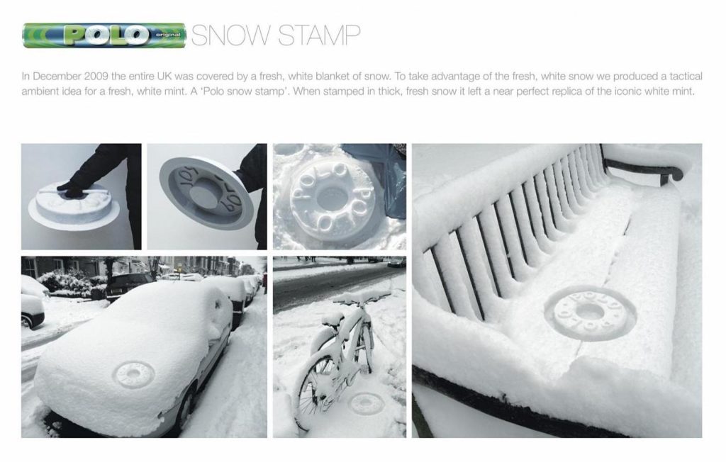
In my little Advertising Hall of Fame there’s this Polo ad.
To express the freshness of these little mint sweets, in 2009 Creatives at JWT London (Phillip Meyler et Darren Keff) had the amazing idea (and also super eco-friendly, we would insist on this point in this day and age) of making molds and waiting for the snow…
Imagine how surprising it would have been for Londoners in the morning, discovering their city full of sweets! It would be difficult to say freshness with as much efficacy, as much poetry and as much… freshness. Advertising should always look like this. “In exchange of the attention you give my brand, here is a little gift”. Advertising should always carry the Christmas spirit.
Allez, happy holiday everyone!
Rémi Noel
Creative Director
& Photograph
.
.